Data embodiment through embroidery
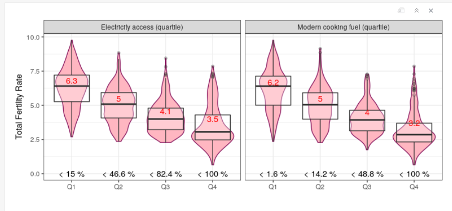
As much as I enjoy crunching data and coding, spending my day in front of my R session can be frustrating sometimes, especially since I love to use my hands on crafts. I found a solution to embody my data into something tangible. I embroidered one of the plots from my first PhD paper. I did this because I noticed that when changing the colors of my plot to pink and red, the violin plots transformed into beautiful vulva plots. I found this particularly relevant to illustrate my paper on reproductive choice and fertility.
The plot from the paper looks like this:
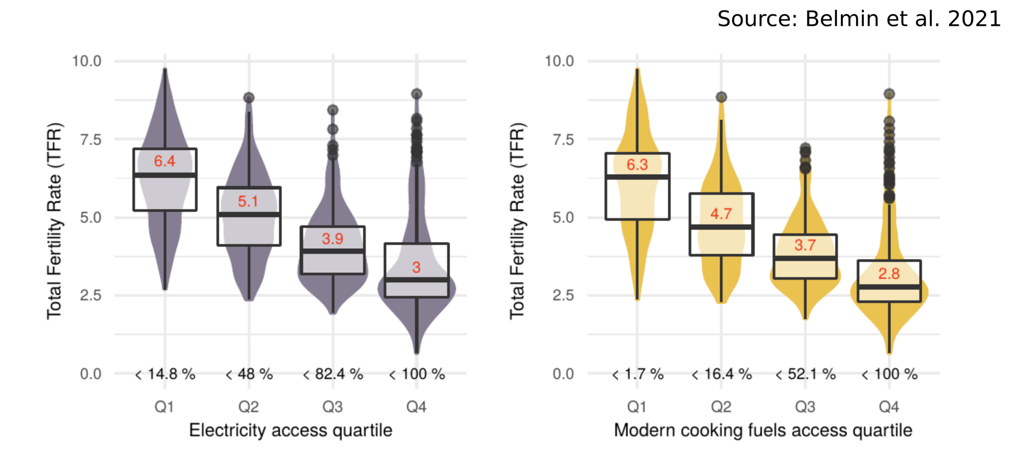
This plot represents the total fertility rate in 403 subnational regions in 42 countries, in four groups (or quartiles) of regions: (1) regions in which the percentage of people having access to electricity is 14.8% or lower, (2) 48% (3) 82.4% and (4) 100%. We can see that in regions with a high percentage of people having access to electricity, the total fertility rate (~average number of children per women) is much lower. For those who wonder, we tried to show in this paper that this is more than just a simple correlation. Basically access to electricity and modern fuels for cooking improves the well-being of women, saves time on household cores (the burden of which is overwhelmingly carried by women), improves health and access to information. These factors enable women to make better reproductive choices, which tends to lead to fertility decline.
Now, the vulva version looks like this:
This plots was so beautiful that I decided to embroider them. In addition to looking pretty good, it also enables me to take a step further the relation with women on this paper, as embroidery tends to be a craft mostly done by women. Nothing essentialist here. Surely the fact that women tend to do embroidery more than men is a product of genderization. But in any case, I love embroidery and it connects me to my powerful grandmother. I am sure she would be proud.
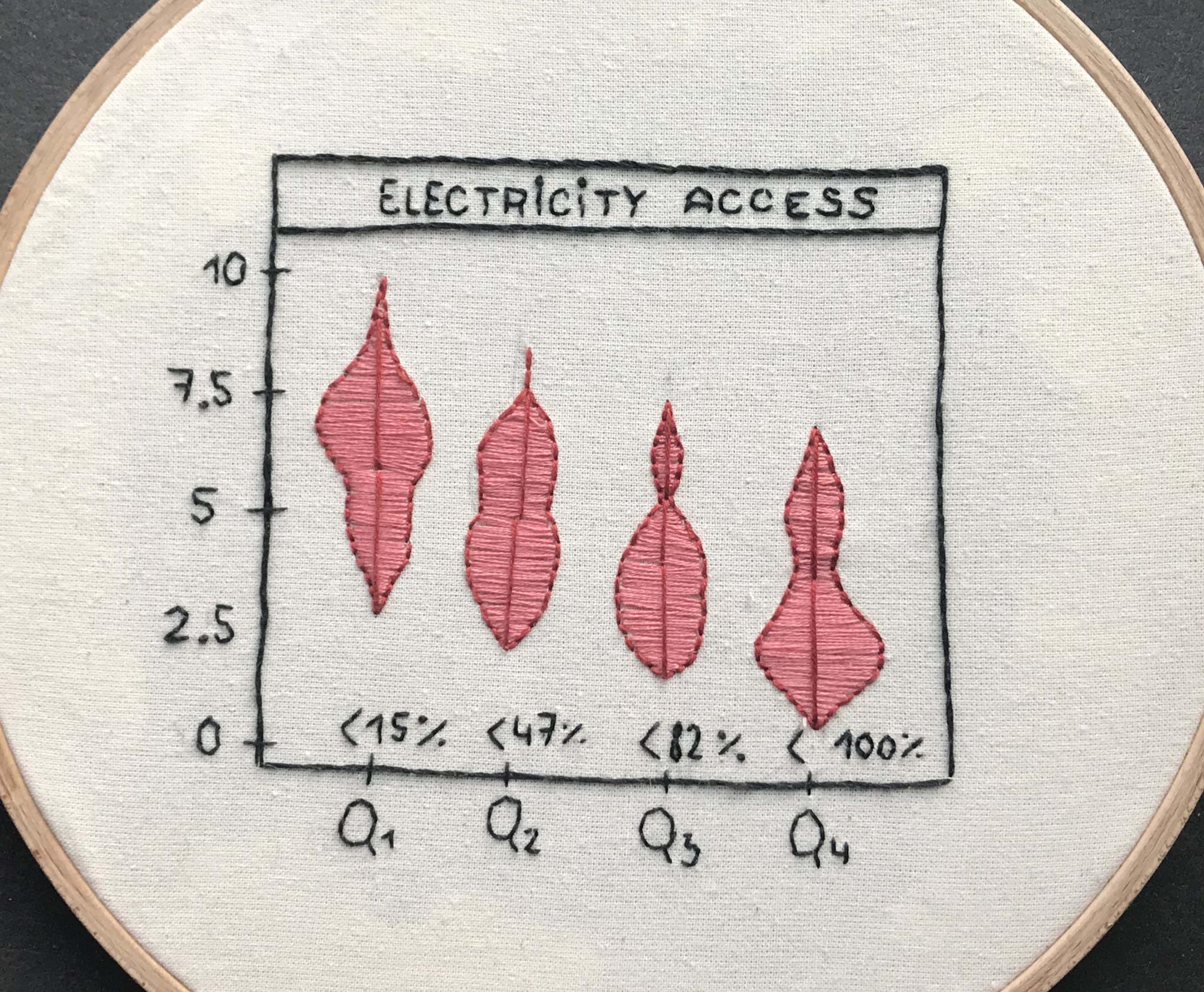
I also like the back of the piece, showing the process and the trial and errors (e.g. on the right I filled the back of one of the violin until I realized this was unnecessary and wasted thread). Some of it looks like the writings of an ancient language.
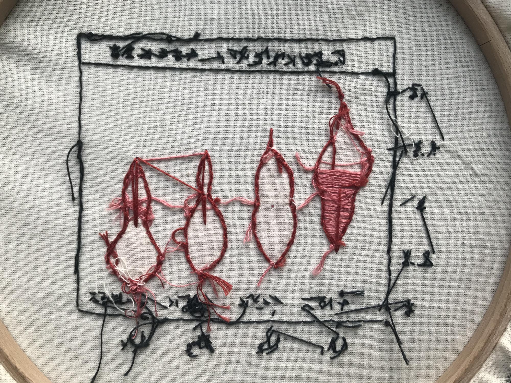
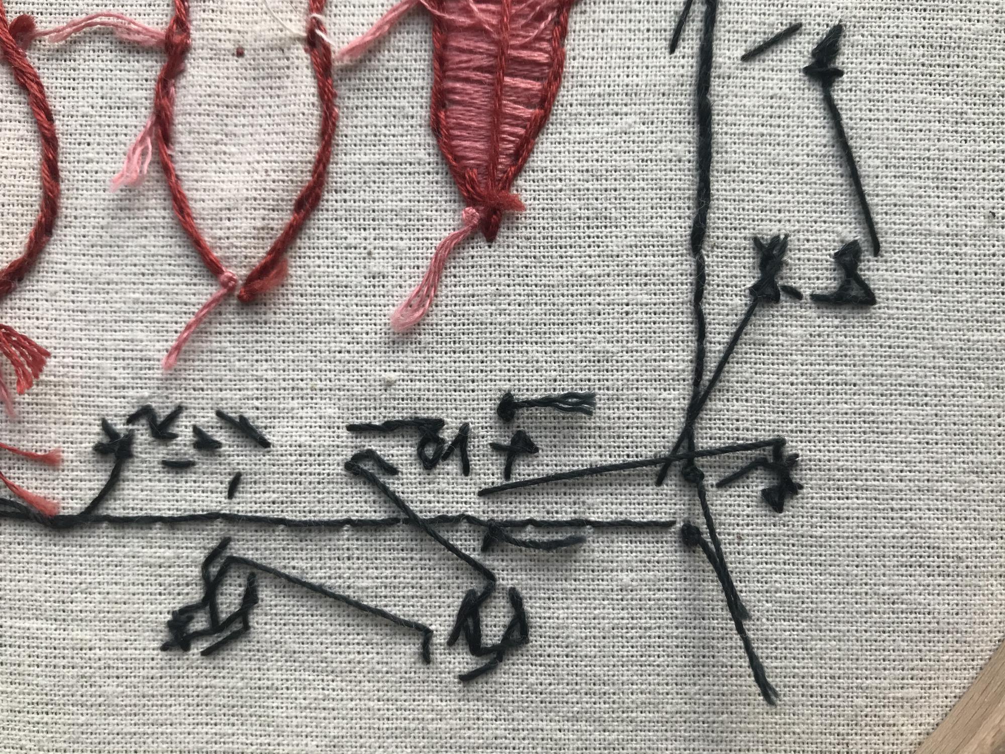
How does the back of a R ggplot looks like?
PS: the code to reproduce the figure is on my gitlab here > and go to “Plot of energy quartiles, generation”.
Camille Belmin
PhD Candidate
I am a PhD candidate at PIK. My research interests include demography, energy, sustainability and gender.